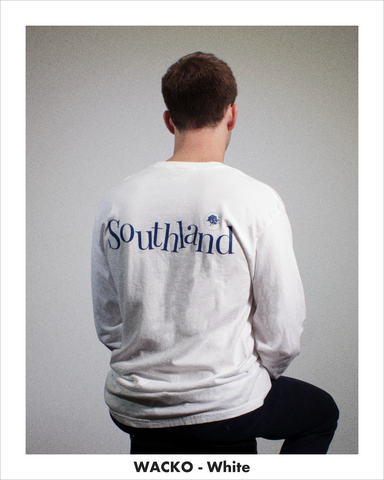
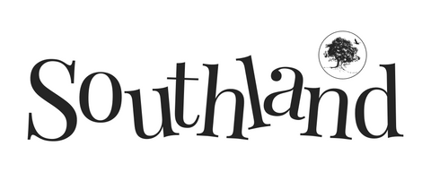
Our Wacko shirt is one of my personal favorites from our Fall/Winter collection this year. Wacko takes Southland's primary wordmark in a fun direction by jumbling up the letters a bit and employing an oversized back print.

Designing the Wacko shirt was a fun experience for me, as it was one of the first I designed for our new collection. As I worked through Wacko, I moved slightly away from the straight-line, uniform principles that have guided most Southland designs in the past. That said, the end result doesn't feel like it strays far from Southland's longtime aesthetic at all.
I liked Wacko so much that I designed a completely new alternate wordmark incorporating looser lines and a freer style (this alternate wordmark is featured on the Ober shirt in charcoal and green).

When I made the decision on which shirt to print Wacko on, I went with a long sleeve white Comfort Colors tee, because white gave the design itself the biggest stage to stand on with the imprint as the focal center of the garment. After experimenting with greens and oranges, I chose a darker blue to serve as the ink color for Wacko - I think this blue is does a fantastic job of standing out without screaming 'COLOR' too loudly.
In person in particular, the design is a show-stopper.
I'd be remiss if I wrote this without explicitly plugging the shirt, so if you'd like to buy a Wacko shirt for yourself click here.
-Andrew
